Project Overview:
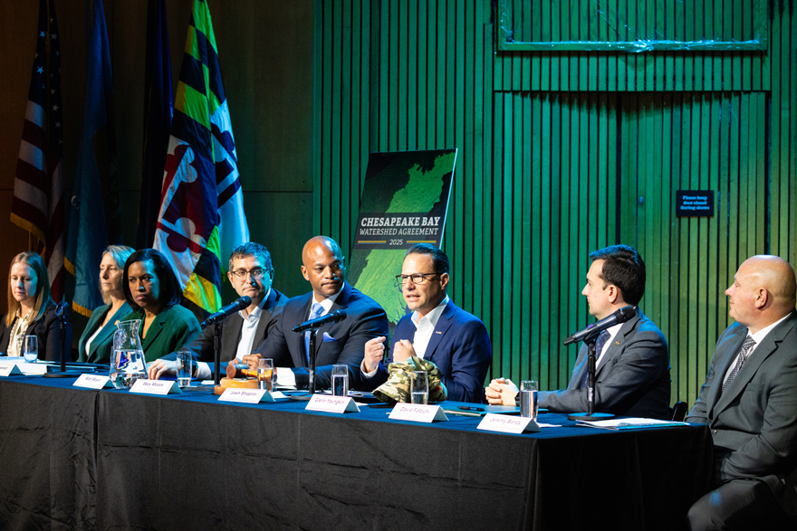
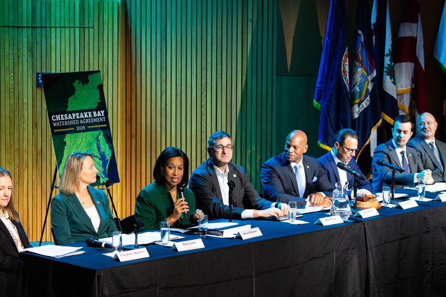
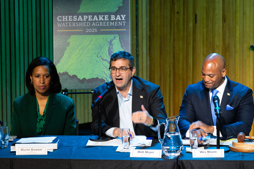
The Chesapeake Bay Watershed Agreement 2025 is a high-visibility publication that communicates the partnership’s shared restoration blueprint to audiences including media, partner agencies, policymakers, and state and local governments. It needed to feel credible and unmistakably Chesapeake Bay Program—while also being easier to read and understand than a typical policy document. The updated 2025 Agreement was approved by the Chesapeake Executive Council—made up of the governors of Delaware, Maryland, New York, Pennsylvania, Virginia, and West Virginia; the Mayor of Washington, D.C.; the U.S. Environmental Protection Agency Administrator; and the chair of the Chesapeake Bay Commission—on December 2, 2025.
I led the project end-to-end: aligning stakeholders, setting design direction through comparative analysis, designing the publication and supporting visuals, delivering both print and accessible interactive versions, overseeing production, creating a 24x36 foam-backed poster used as a visual backdrop for the Executive Council approval meeting, and redesigning the companion ChesapeakeBay.net webpage to match the final Agreement. The work moved from early direction to final production on an accelerated timeline, including late-stage content changes and additional review rounds.
Goals:
- Strengthen brand recognition for the Chesapeake Bay Program through consistent, confident design.
- Improve comprehension and credibility with clear hierarchy and purposeful visual structure.
- Make the document easy to read and scan for busy, high-stakes audiences.
- Deliver an accessible interactive PDF compliant with Section 508/WCAG 2.0 AA.
Constraints:
- Compressed timeline with late-stage content changes and additional review rounds beyond the original plan.
- Stakeholder involvement expanded significantly beyond what was initially advised, increasing feedback volume and alignment needs.
- Print production turnaround in under two weeks (pre-press QA, bleed/crop setup, and delivery coordination).
- Needed to meet both high production polish and Section 508/WCAG 2.0 AA accessibility compliance on the same schedule.
Pain Points:
- The content was essential, but risked reading as a dense, text-heavy document rather than a clear narrative framework.
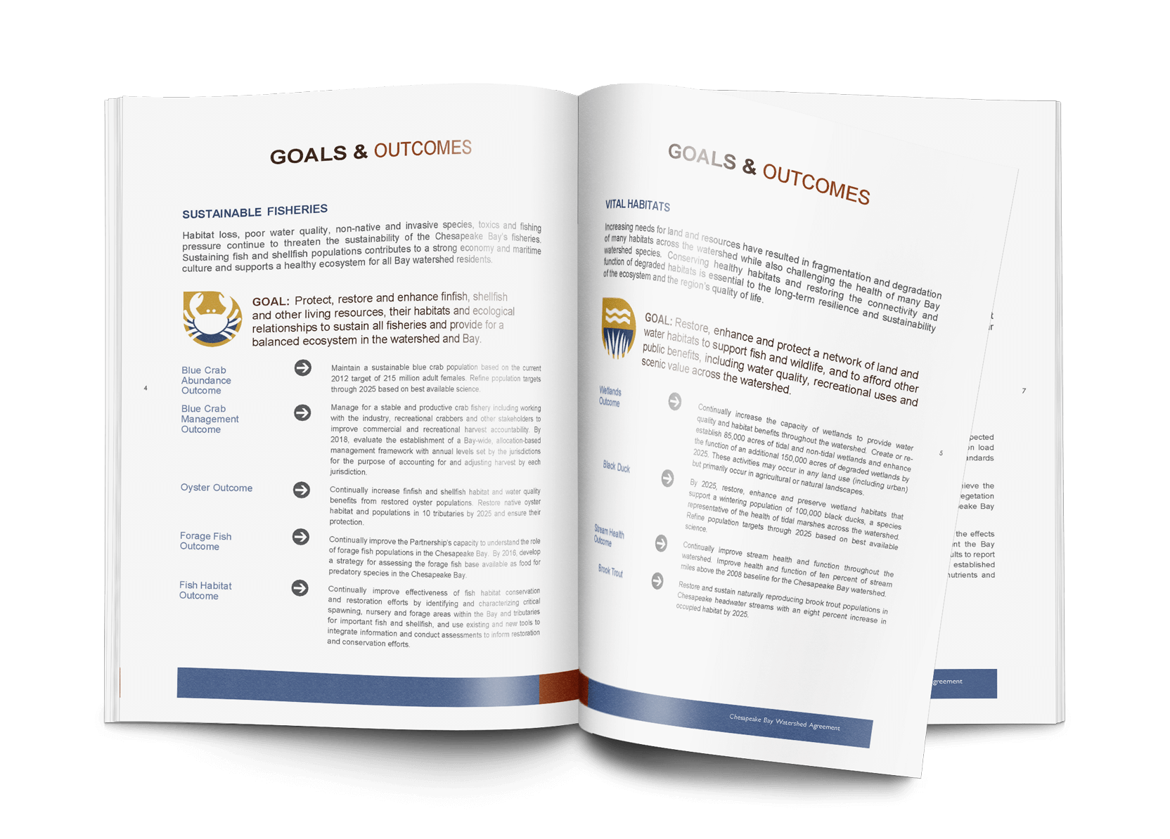
- The 2014 Agreement provided precedent, but readability improvements were needed (alignment consistency, line length, pacing, and hierarchy).
- Goals, outcomes, and targets required stronger visual differentiation for quick comprehension.
- The digital version needed to meet Section 508/WCAG 2.0 AA requirements without sacrificing design quality.
My Role:
- Project lead across design direction, production, and stakeholder coordination.
- Publication design (cover + interior system) in InDesign.
- Custom graphic design in Illustrator.
- Accessibility build + QA (InDesign structure + Acrobat checks).
- Print production oversight and vendor coordination.
- Poster design (cover-derived) for Executive Council meeting.
- Companion webpage redesign in Figma to match the publication.
Who I Worked With:
Chesapeake Bay Program Director of Communications, Chesapeake Bay Program leadership, and leaders across partner organizations.
Research & Comparative Analysis:
To guide the design direction, I compared the 2014 Agreement alongside story-forward publications from leading organizations to identify patterns that improve long-form readability and engagement.
Key Findings that Shaped the Design
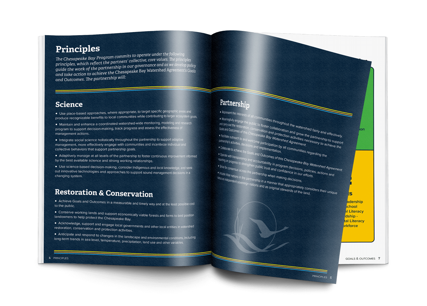
- Standardize left-aligned typography (avoid mixed alignment) for consistency and readability.
- Maintain Chesapeake Bay Program branding and palette for recognition and trust.
- Improve scan-ability with stronger hierarchy, shorter line lengths, and better pacing.
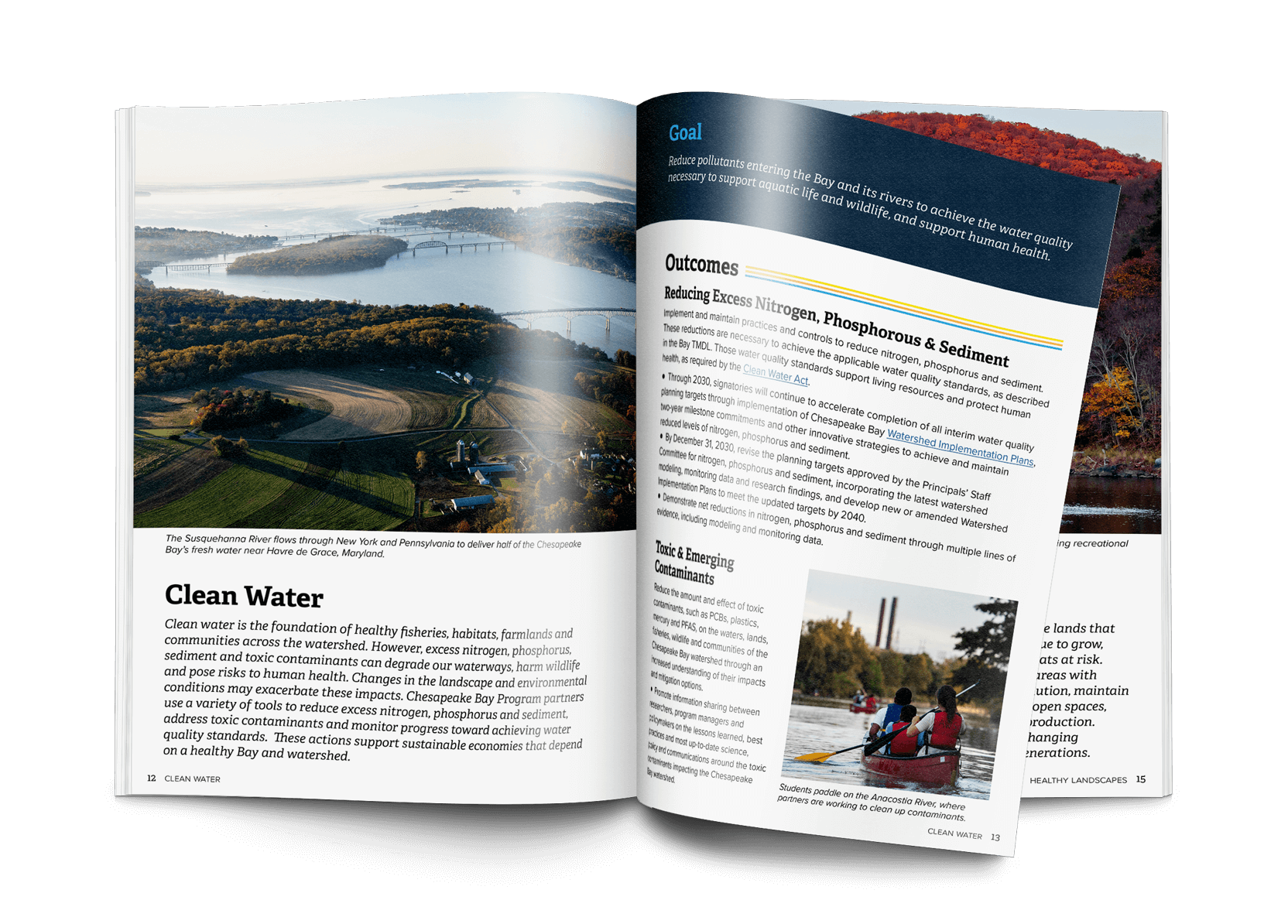
- Use imagery intentionally—full-bleed section breaks, chapter openers, pull quotes, and captions—to reduce fatigue and guide readers.
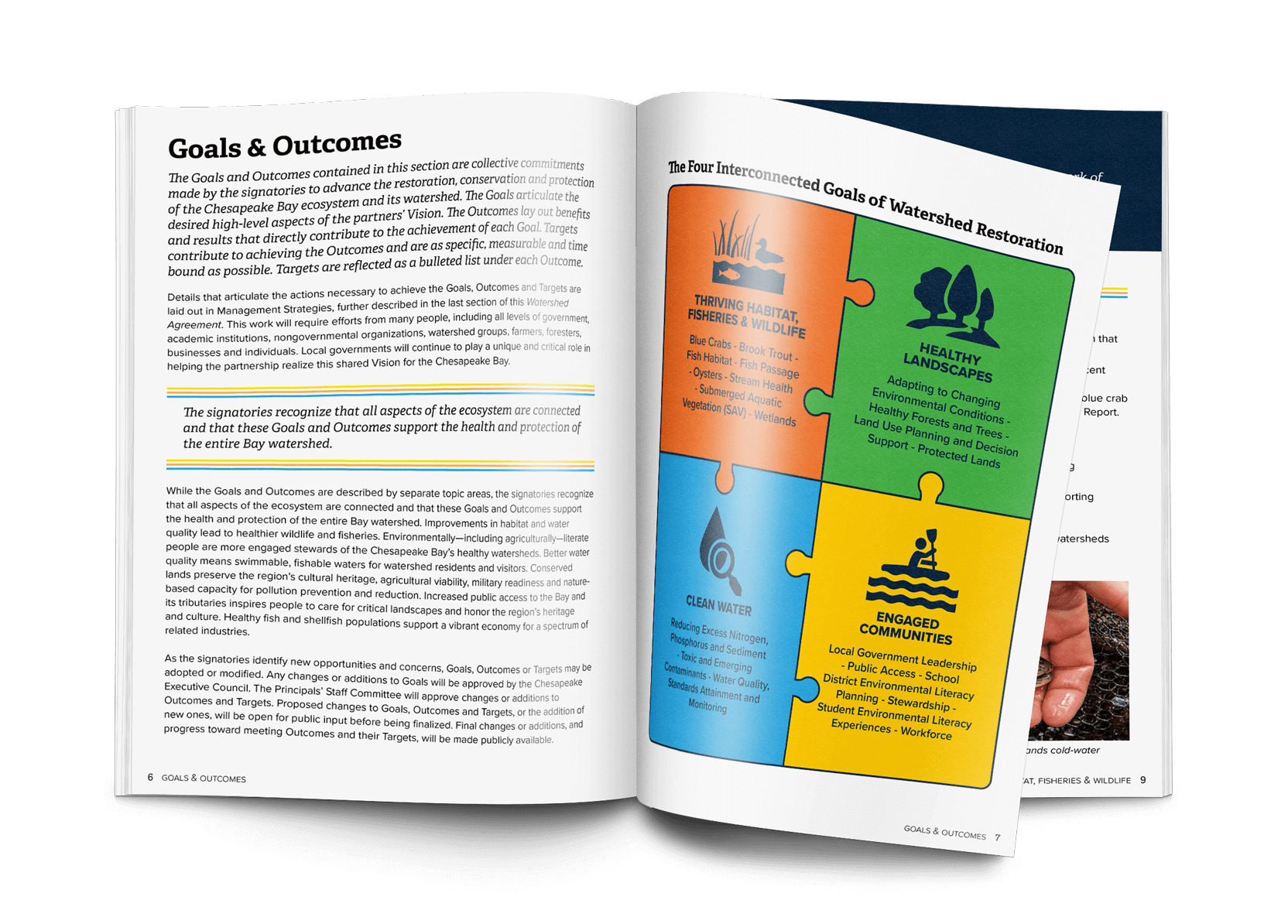
- Differentiate goals, outcomes, and targets using repeatable headers, color bands, and label structure.
- Body copy began as two columns, but was revised to single-column based on stakeholder feedback for easiest reading.
The Solution:
A story-forward, branded publication system that balances clarity and credibility with visual pacing—delivered as both a polished print edition and a compliant interactive PDF. The same visual system extended into a meeting poster used during the Executive Council approval and into a redesigned webpage for public-facing access.
Design Details:
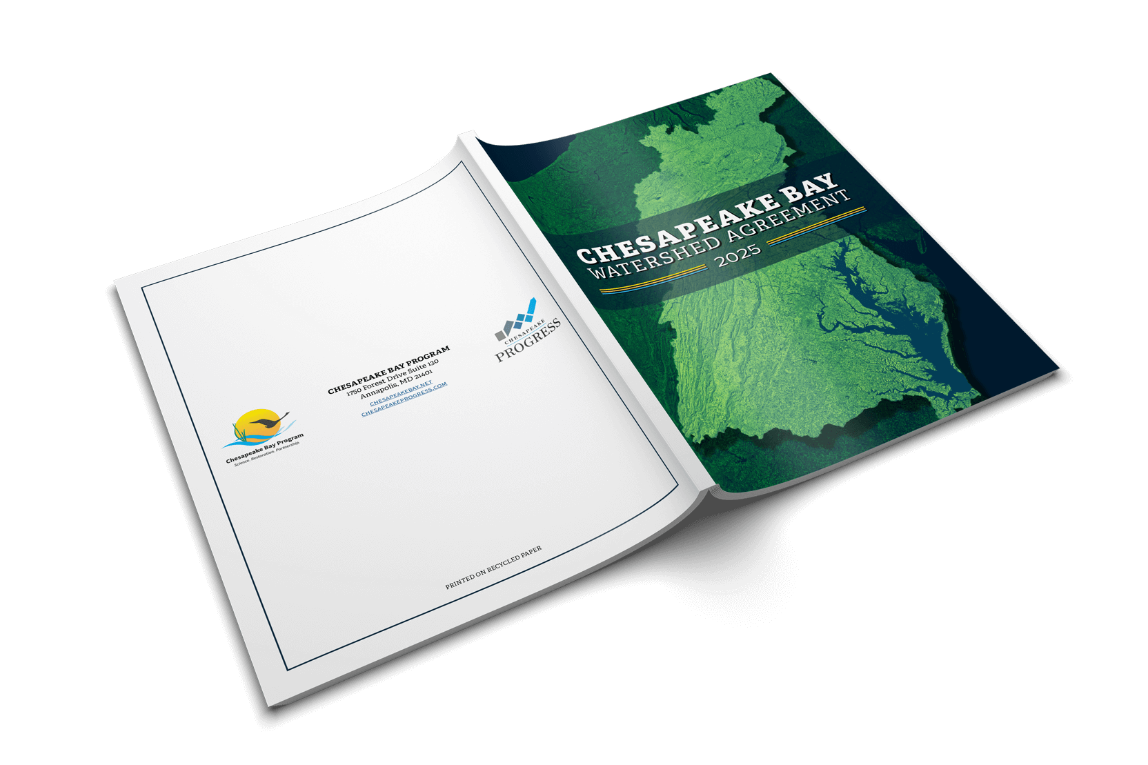
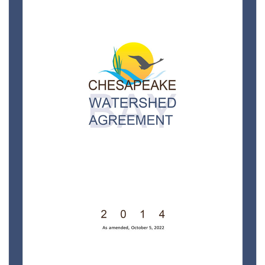
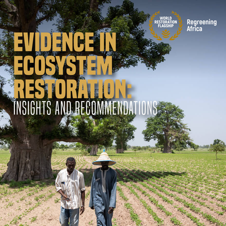
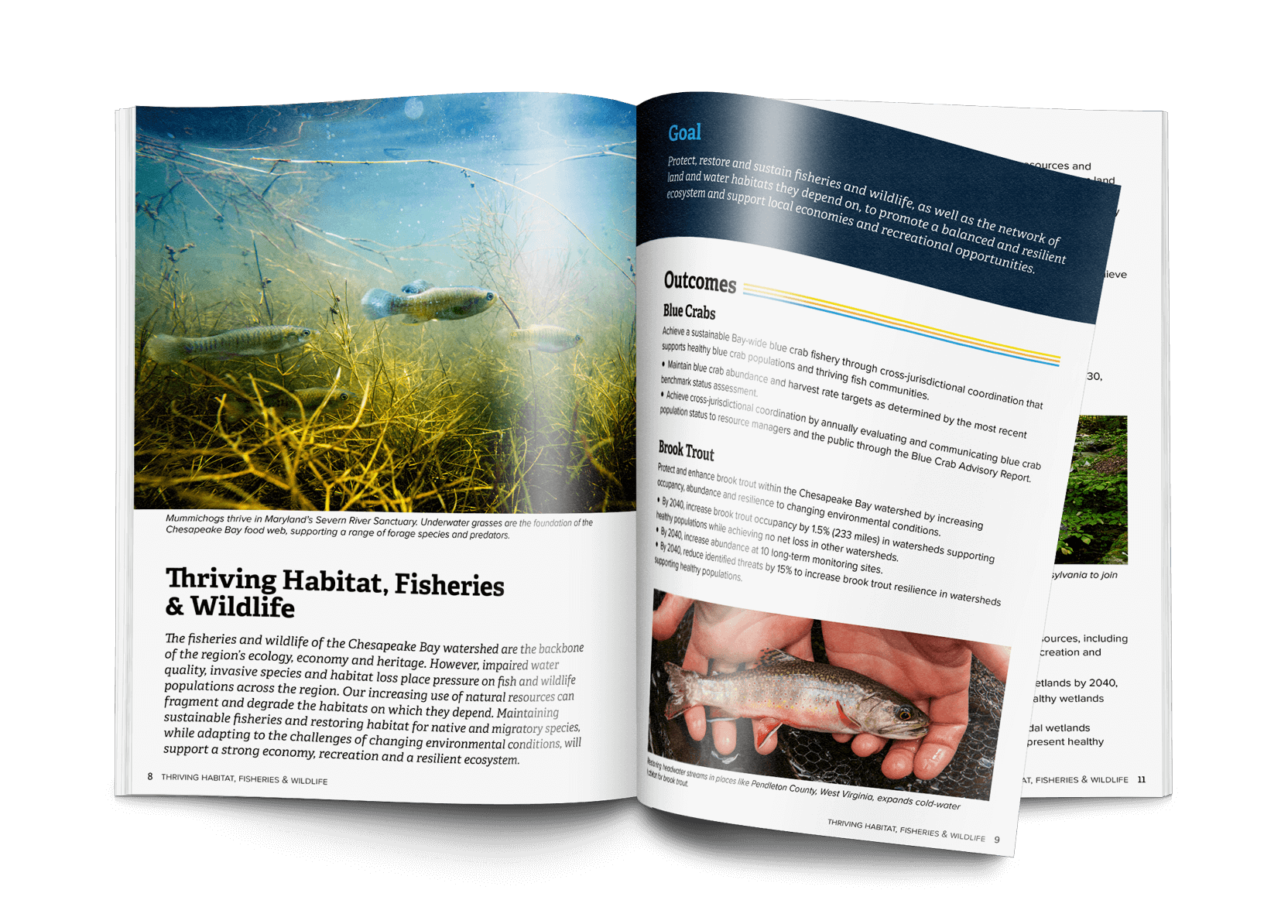
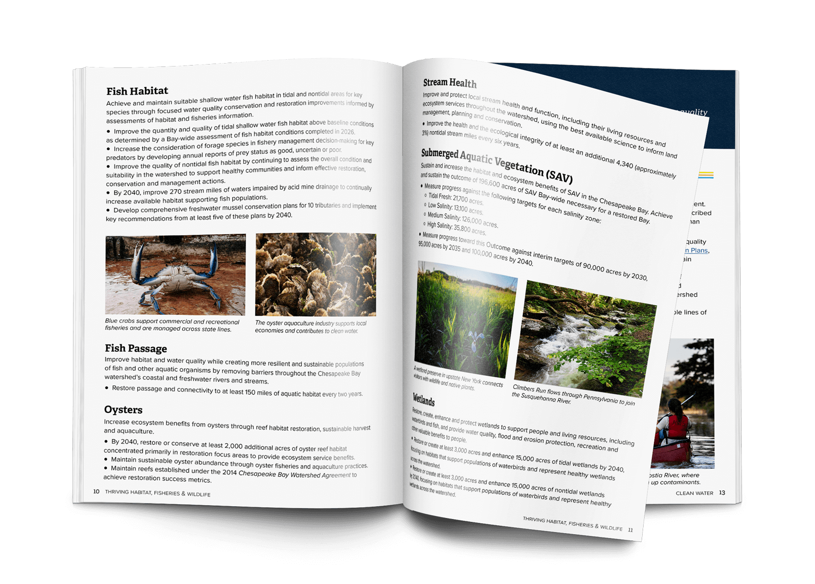
- Front cover design: Designed the front cover using Chesapeake Bay Program brand colors and a layered, depth-driven composition that visually connects land and water systems. The imagery reinforces how the watershed functions as one connected network and clearly signals its scale across six states and Washington, D.C. The result feels intentional, polished, and authoritative—signaling an official, credible publication through clear branding and a decisive composition.
- Typography: Selected Adelle for headings to create a professional, distinctive voice that scans well, paired with Proxima Nova for body copy for high readability. Body text was set slightly larger than typical to reduce fatigue and support long-form reading.
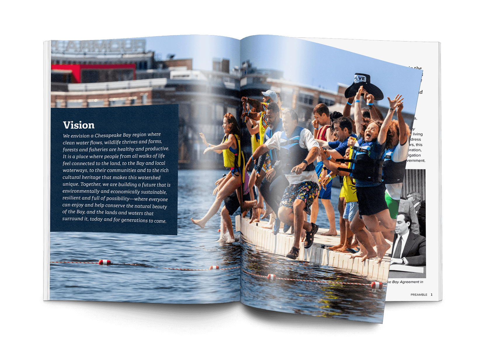
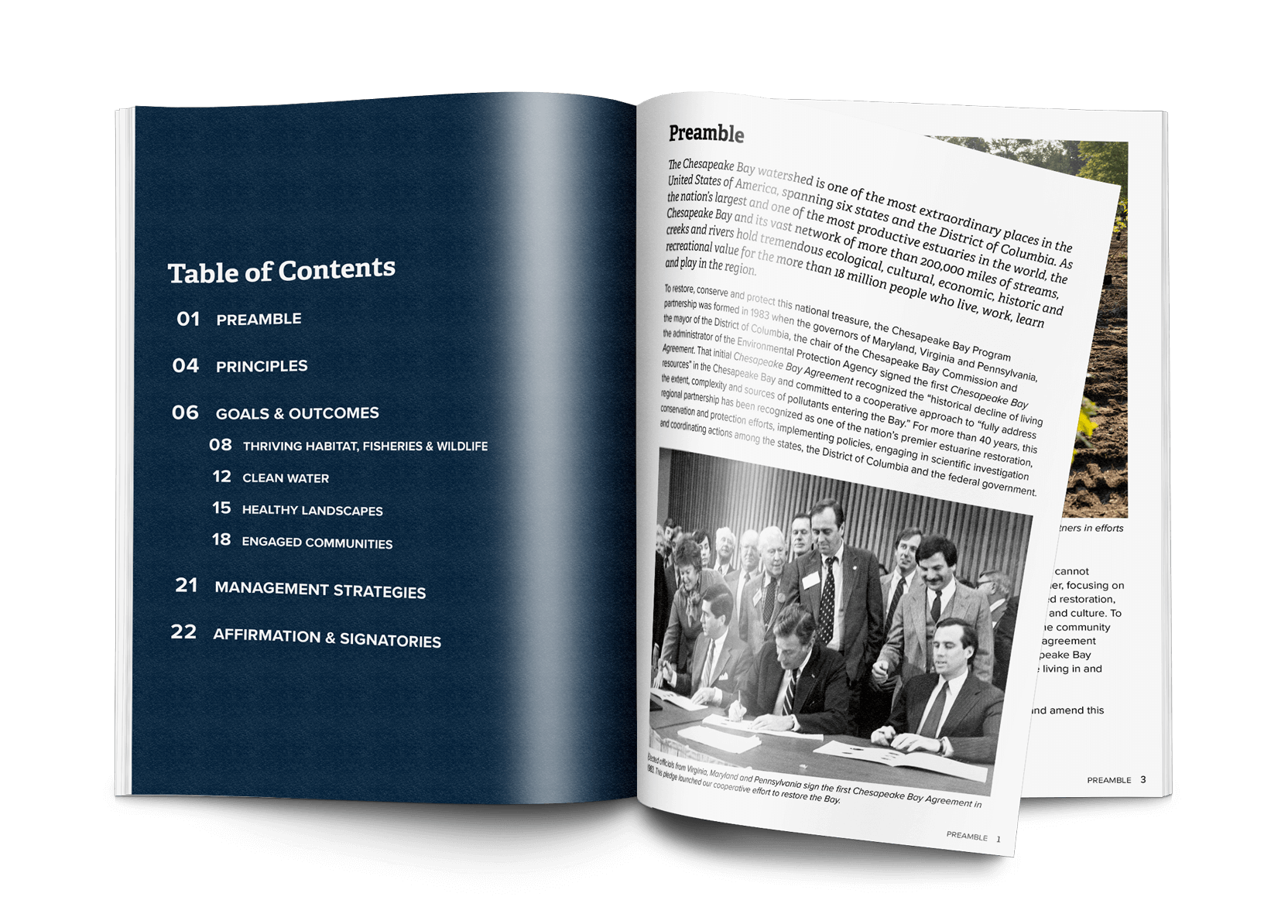
- Visual pacing: Used full-bleed imagery, chapter openers, pull quotes, and photo captions to create breathing room and guide readers through complex content. These elements break up long sections of copy and help the publication read more like a narrative than a reference document.
- Hierarchy system: Built a consistent hierarchy using section headers, color bands, and repeated labels to clearly distinguish goals, outcomes, and targets. The repeatable structure improves scanning and makes it easier to understand how pieces of the Agreement relate to one another.
- Brand alignment: Applied Chesapeake Bay Program brand guidelines throughout to maintain consistency and credibility. The result feels cohesive and official across print, interactive, and supporting materials.
Custom Graphic: Visualizing Interconnected Goals and Outcomes
I developed a custom “puzzle” graphic representing the Agreement’s four goals and the outcomes within them, designed to communicate interdependence in a way that felt aligned with an environmental theme. An early concept suggested connected gears, but I recommended a metaphor that avoided a mechanical tone while still clearly showing how parts work together. The final graphic was used in the publication and reused across other media (presentations and supporting materials).
Accessibility: Section 508 / WCAG 2.0 AA Interactive PDF
The interactive PDF was built with accessibility integrated into layout and structure decisions so it remained compliant and visually consistent.
Steps Taken
- Set logical reading order in InDesign.
- Produced and verified semantic structure to support tagging.
- Created a linked Table of Contents and a complete bookmark set aligned to headings.
- Added alt text for images and key graphics; for full-page imagery, split elements as needed so each could carry appropriate alt text.
- Confirmed document requirements (title metadata, language, navigation structure).
- Ran QA using Acrobat Accessibility Checker and resolved issues during final remediation.
Print Production:
- 28 pages, letter size, saddle-stitch binding.
- 80 lb Chorus Art Gloss Text (recycled paper).
- 500 copies, local vendor.
- Included bleed and crop marks; shipped directly to the office.
Executive Council Poster:
I designed a 24x36 foam-backed poster based on the publication cover for use as a presentation backdrop at the Executive Council meeting where the Agreement was formally approved. By using layered visuals and depth, I illustrated the watershed’s geographical scope and environmental significance, making the complex subject matter more accessible and engaging for attendees.
The poster not only served as a key visual element during the approval process but also reinforced the publication’s overarching theme of collaboration across the watershed’s diverse stakeholders. The continuity of the visual design helped underscore the shared mission of regional environmental stewardship and the interconnected goals of the restoration framework.

Companion Webpage Redesign:
In addition to the publication, I redesigned the ChesapeakeBay.net Agreement page to reflect the updated Agreement. The original page was primarily text with minimal visuals; the updated version aligns to the publication’s hierarchy, pacing, and branding to create a clearer, more engaging digital entry point.
Scroll to explore the full page.
Scroll to explore the full page.
Final Outcome:
- A story-driven Agreement publication that is easier to scan and understand for high-visibility audiences.
- Two finalized formats: print + Section 508/WCAG 2.0 AA interactive PDF.
- A reusable visual system (including the puzzle graphic) used across other communications.
- A cover-derived poster supporting the Executive Council approval moment.
- A redesigned companion webpage aligned to the publication.
Chesapeake Bay Program staff shared the following feedback:
“Gorgeous.”
“The designed version brought it to life—it helped it dramatically.”
Key Takeaways:
- Translate complexity into meaning: Visual storytelling connected technical content to real-world impact without changing the underlying message.
- Hierarchy and pacing change everything: Strong structure and visual rhythm can make complex policy content approachable without oversimplifying it.
- Accessibility works best when it’s planned early: Building structure and navigation into layout decisions kept the interactive PDF compliant and polished.
- Design leadership means managing change: Keeping the work clear and consistent—even as content shifts late in the process—was critical to the final quality.