Project Overview:
This project significantly improved the internal experience for staff and partners on Chesapeakebay.net by transforming how organizational information and team resources are accessed and understood. Guided by in-depth user research I led from initial discovery through usability testing, the work included a comprehensive redesign of the organizational structure and group/team pages, along with key improvements to meetings management. These changes streamlined communication, boosted usability, and enhanced accessibility. By delivering intuitive navigation and seamless access to meeting materials—past and upcoming—this initiative eliminated major pain points and empowered teams to collaborate more efficiently and confidently.
Pain Points:
Our internal staff, which works across over 50 teams in a partnership organization, faced challenges navigating and interacting with internal resources. The problems identified included:
- Unclear organizational structure: Users found it difficult to understand group roles, connections, and the overall hierarchy across the partnership.
- Limited accessibility: The “How We’re Organized” page was not accessible to screen readers, creating barriers for some users.
- Incomplete group visibility: Many teams were not represented on the organizational structure page, making it harder for users to locate relevant groups.
- Inefficient navigation on group pages: Users struggled to quickly access specific sections or content, impacting overall usability.
- Meeting content hard to retrieve: Accessing past meeting minutes, agendas, and related files required multiple steps and lacked centralized organization.
- Lack of clear points of contact: Users had difficulty identifying the appropriate individuals for specific teams or groups.
- Inconsistent or unclear content labeling: Group and project information was not always labeled in a way that supported quick scanning or future use.
Scroll to explore the full layout.
The Solution:
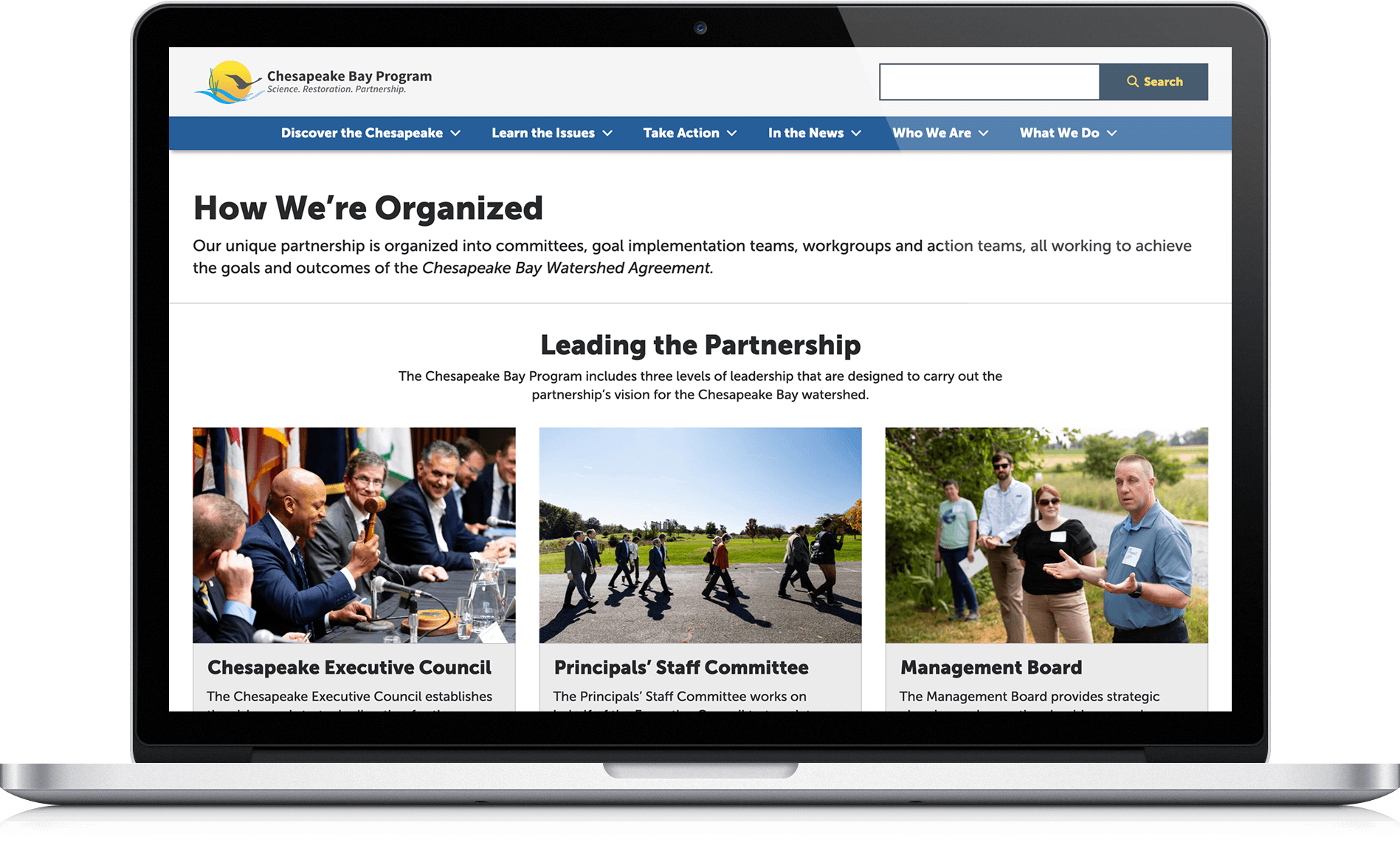
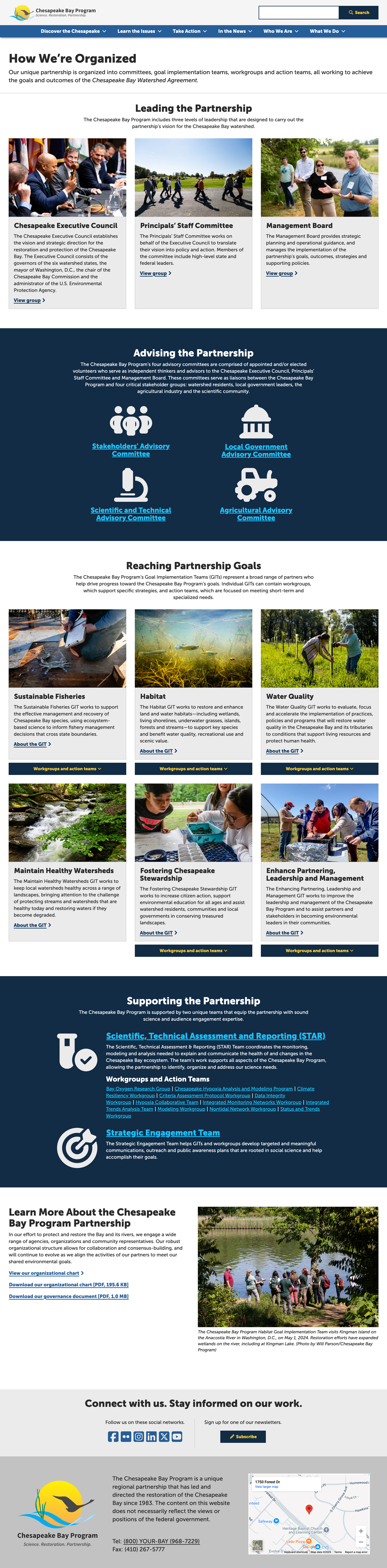
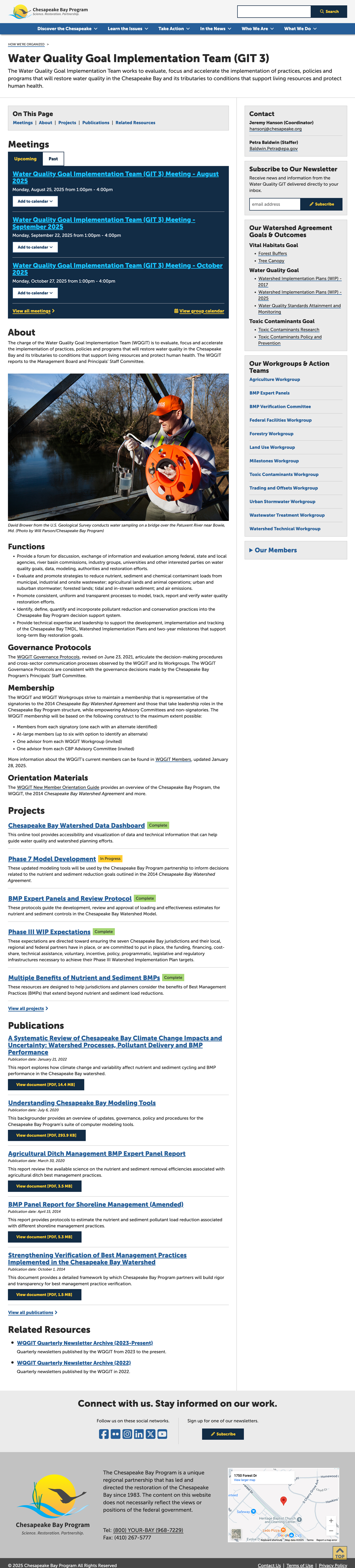
The “How We’re Organized” page was restructured with a clearer, more accessible layout that explains team roles and connections, while the organizational chart was redesigned for easier comprehension and moved to its own dedicated page. Group and team pages gained a table of contents for improved scan-ability, a streamlined content hierarchy, and a contact block for key team members. The Scope & Purpose block was renamed “About” and expanded with sub-sections like Origin, Scope, Purpose, and Priorities to better communicate each group’s work.
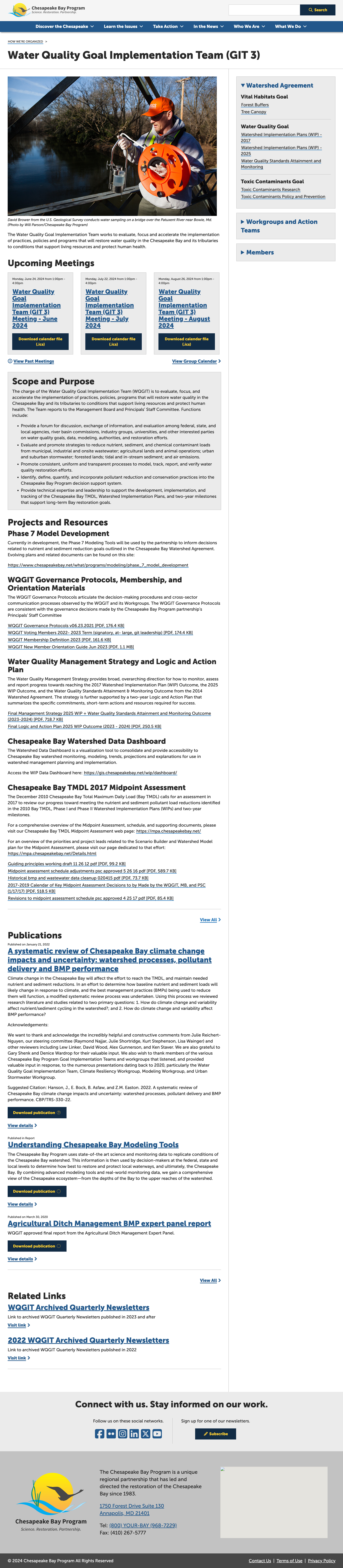
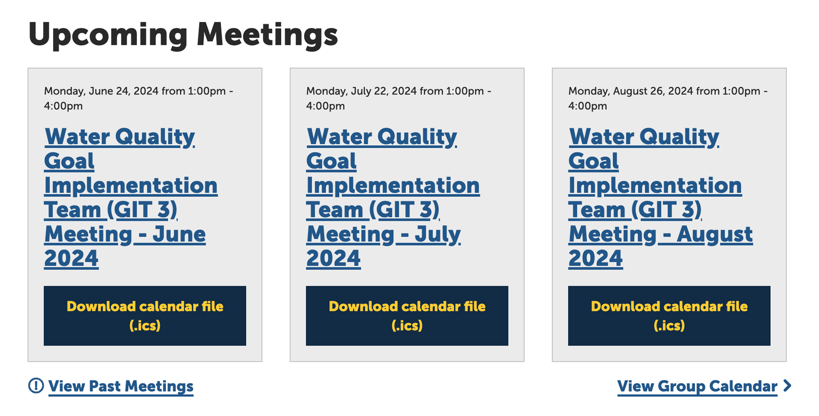
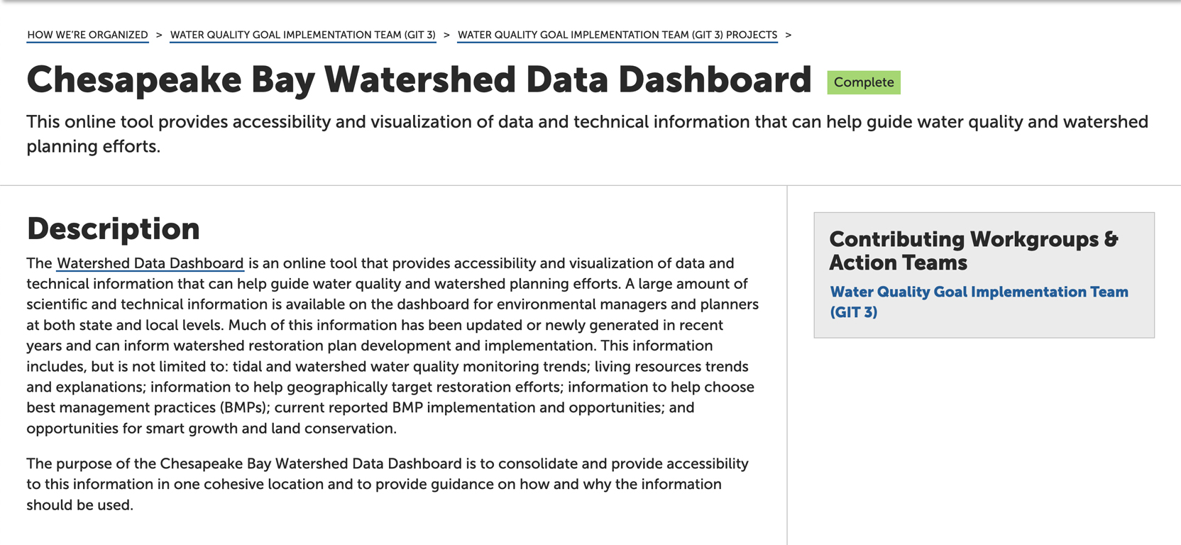
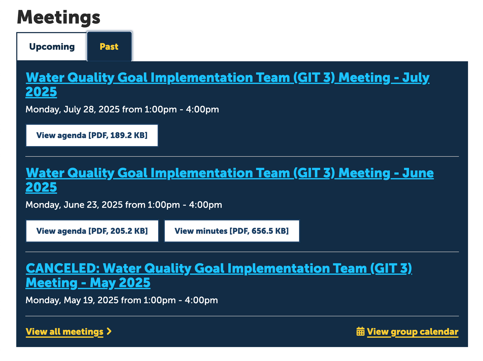
To improve communication and resource access, meetings now display both upcoming and past meetings in one view, with direct downloads for agendas and minutes. Dedicated project pages with predefined content fields were also introduced to ensure consistent documentation and better organization of ongoing initiatives. These changes were guided by user feedback, comparative analysis, and iterative testing to meet the needs of internal staff while preserving familiar workflows.
My Role:
- UX Research Lead: Directed the research process by developing questionnaires, conducting user interviews, performing a comparative analysis, and analyzing data to identify user needs and pain points.
- Ideation Facilitator: Led ideation exercises with the team to explore solutions that addressed research findings and aligned with project goals.
- Product Designer: Designed high-fidelity prototypes informed by research insights and user feedback to visualize and validate design concepts.
- Usability Testing: Planned and facilitated user testing, iterating on designs based on findings to refine and improve the final solution.
- Graphic Designer: Created the magnifying glass illustration featured in the Organizational Chart page’s call-to-action, enhancing visual emphasis and guiding users to the full “How We’re Organized” page.
Who I Worked With:
This project was a collaboration between myself and the Chesapeake Bay Program Web Team which included developers, content strategist and project manager.
User Research & Data Collection:
I began by gathering feedback from internal staff through two main questionnaires. These questionnaires were designed to understand the pain points with the existing pages and identify user needs for improvement. In addition to the questionnaires, I led a comparative analysis of similar organizational structure pages to identify best practices and design trends. This informed the ideation process, where we brainstormed strategies to improve communication of group roles, enhance usability, and simplify the navigation of team pages. The insights from the research, analysis, and ideation were combined to develop a user-centered approach for the redesign.
First Questionnaire:
This was distributed to teams and management to gather general feedback on their group and team and meeting pages. The feedback was from over 40 respondents across 8 teams. Key insights from the responses included:
- Reordering, renaming, and adding content on group and team pages.
- Improving the Meetings section and add features such as downloadable agendas and meeting minutes.
- Improving the communication of connections between the organizations various groups and teams.
- Creating individual project pages so groups and teams can better communicate and organize their work.
Second Questionnaire:
The second questionnaire focused specifically on improving the group and team pages and gaining deeper insights into user needs. Some important insights included:
- Users wanted improved scan-ability of group pages, a clear content hierarchy, and quick access to relevant team information.
- Participants requested dedicated pages for projects with predefined content fields to streamline documentation.
- Users also wanted an easier way to access meeting minutes and agendas and the ability to download them in bulk.
Comparative Analysis & Ideation Exercise:
- Led a comparative analysis of organizational structure pages from similar organizations to identify best practices and design trends.
- Spearheaded the ideation process to explore strategies for improving communication of group roles and connections within the organization.
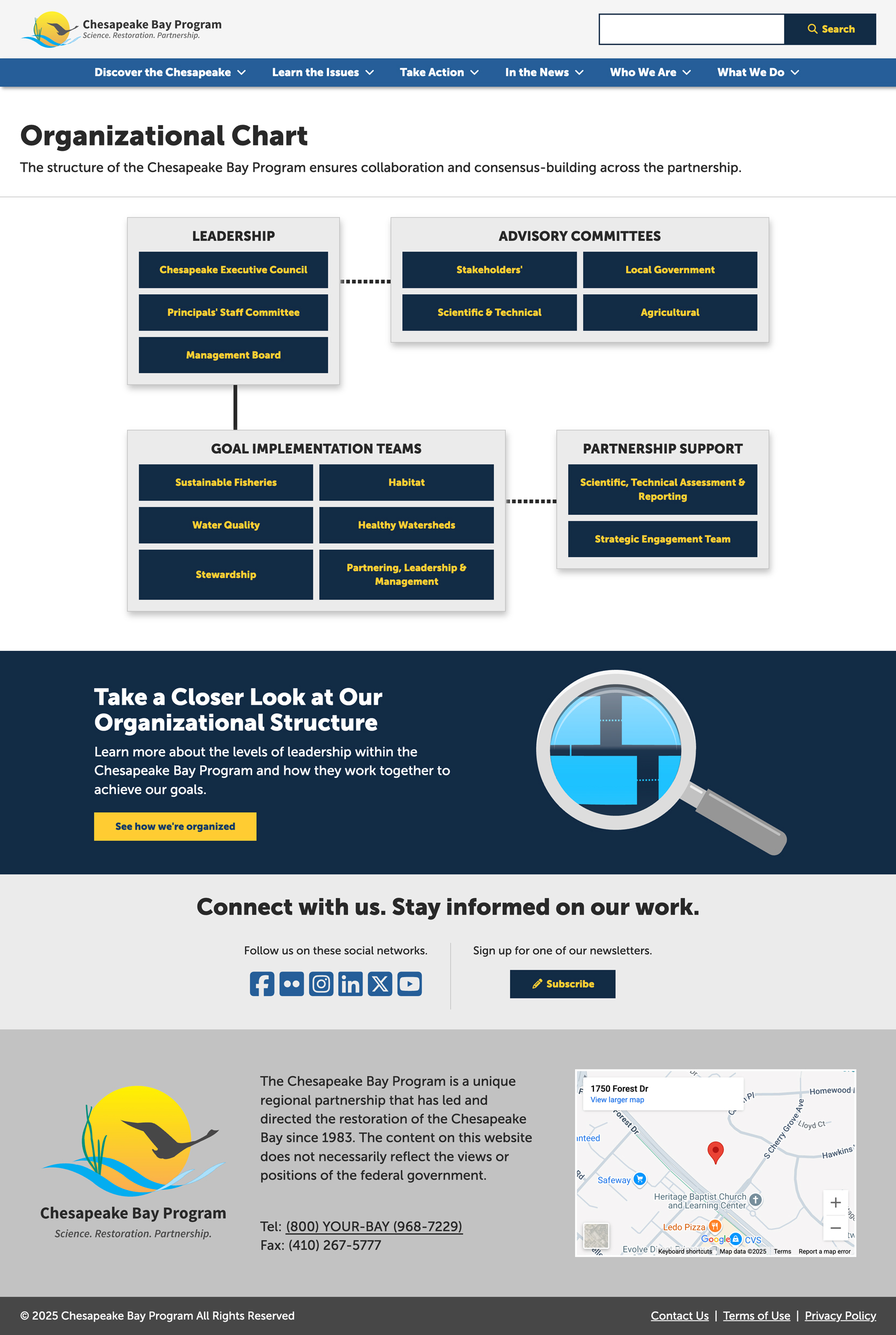
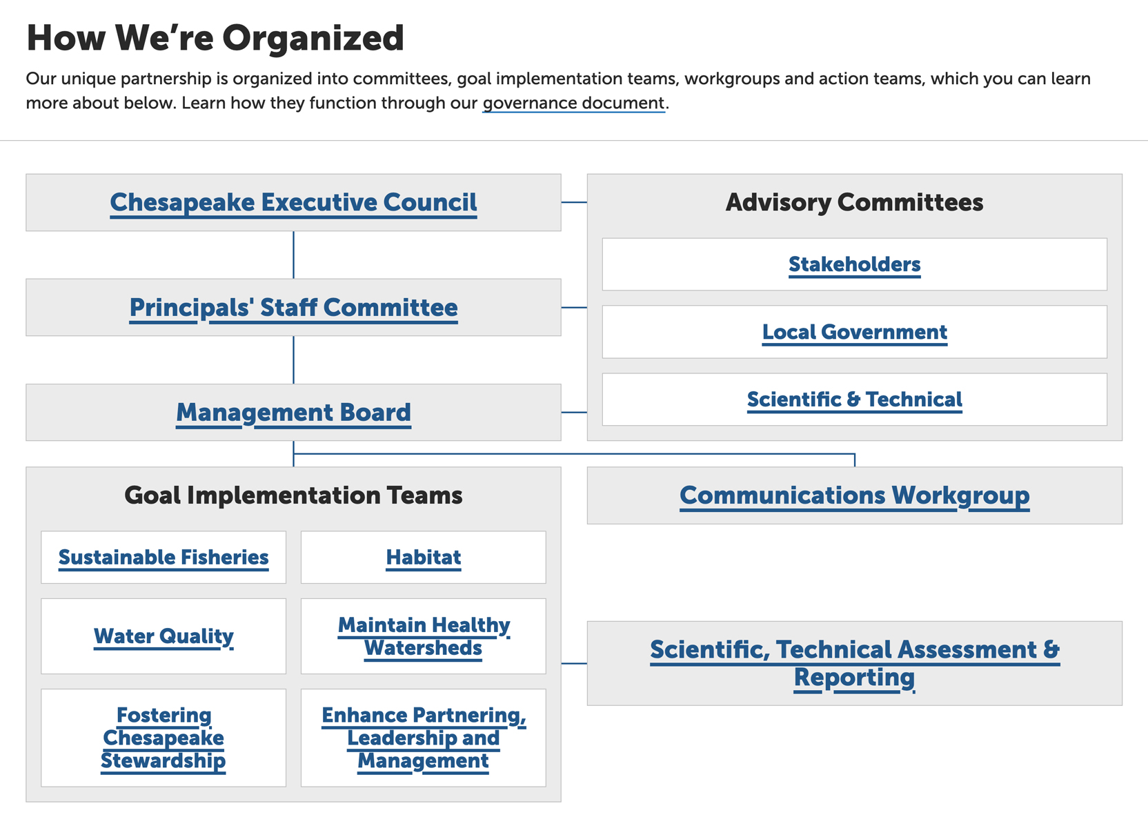
- Revised Organizational Chart: A clearer, more intuitive layout that included descriptive content for each team and a call-to-action linking to the full “How We’re Organized” page. This aimed to enhance both understanding and navigation of the organizational structure.
- Group/Team Pages: I focused on making subtle but impactful improvements to enhance usability without disrupting existing mental models, such as improved scan-ability, adding a contact block, and redesigning the Meetings section to allow users to see both upcoming and past meetings in the same component, with downloadable agendas and meeting materials.
- Iterative Refinement: Prototypes were reviewed with stakeholders and internal teams to gather feedback, which led to refinements and adjustments to ensure the design met user expectations and was aligned with the overall goals of the project.
- Group/Team Pages: The improvements made to the content layout and the addition of a table of contents were particularly appreciated.
- Meetings: All users found it much easier to find past meetings and download meeting minutes and agendas.
- Organizational Structure: While the new "How We're Organized" page layout and content improvements were well received, some users expressed that the organizational chart (which had previously been difficult to navigate) was still important. As a result, we kept the org chart but redesigned it to be more accessible and easier to understand. It was moved to its own page for better visibility and easier access.
- A revised “How We’re Organized” page with a clearer organizational structure and content explaining team roles and connections.
- Group/team pages were made more scannable with a table of contents, contact information, an improved layout and new meetings section.
- Project pages were added, each with predefined content fields and status indicators to help teams document their projects more effectively.
- The redesigned meetings section now allows users to easily access past meeting minutes and agendas.
- The organizational chart was redesigned to be more accessible and easier to understand, relocated to its own dedicated page and includes a clear call to action to the How We're Organized page.
- User Impact: Users are now able to find relevant content more quickly, access meeting materials with ease, and have a clearer understanding of how different groups and teams are connected across the organization.
- Team Impact: The design changes have streamlined workflows, reduced frustration, and made navigating internal resources significantly easier for staff members.
- Next Steps: Success will be tracked through a post-launch satisfaction survey distributed to GIT, Workgroup, and Advisory Committee members three months after the redesign. Additional questions for GIT Coordinators, Staffers, and content editors will provide insights into the effectiveness of the creative process, stakeholder collaboration, and the overall satisfaction with how ideas and feedback were incorporated into the design. This will allow for both product satisfaction and process satisfaction to be assessed.
- User-Centered Design is Crucial: Designing from real user feedback ensured improvements were tailored to the actual needs of internal teams, making content easier to access and navigate.
- Iterative Design Drives Better Outcomes: Testing prototypes revealed the importance of keeping the organizational chart while improving its usability, highlighting the value of ongoing feedback and iteration.
- Accessibility and Clarity Matter: Redesigning the “How We’re Organized” page and chart improved comprehension of complex structures, reinforcing the impact of accessible, clear design.
- Balancing Consistency with Innovation: Subtle enhancements to group/team pages preserved existing workflows and mental models while delivering meaningful improvements in scan-ability and usability.
- Collaboration is Key to Success: Cross-team collaboration and open feedback loops ensured the design aligned with user needs and was feasible for implementation.
- Data-Driven Decisions Lead to Better Design Solutions: Using questionnaire and testing data guided effective changes, from simplifying meeting access to improving content hierarchy.
Prototyping:
After gathering insights from user research, comparative analysis, and ideation, I created high-fidelity prototypes with mobile, tablet and desktop views using Adobe XD to bring the design concepts to life.
Key elements included:
User Testing:
We conducted a moderated usability test with 7 internal users to assess the redesigned “How We’re Organized” page as well as the group/team pages. The test focused on evaluating the ease of navigation, clarity of the organizational structure, and the accessibility of team-related content. The results were overwhelmingly positive, with users highlighting improvements in content organization and overall usability. Key highlights from the testing included:
One user commented:
"I use the meeting pages a lot, like going back to past meetings... So I think that's interesting to have that more accessible."
Some comments included:
"This page will make it a lot easier for me to tell people my life what I do for work. So I appreciate that, you know so I think that's yeah, I like it. It reduce friction. This makes so much sense because this is how kind of I conceptualize it as well."
"I certainly love all the pictures. I think that helps put faces involved, it personalizes a little bit, it's not just some vague government organization or chart. So I think that's great that they've got people and a description."
"And the diagram is so frequently used. I would hesitate to get rid of it. And for me as a user, like it's so easy to just go to the diagram, click on the box that I need to see. Whereas this, I have to like scroll down."
Final Outcome:
The final design incorporated the following improvements:
Scroll to explore the full page.
Scroll to explore the full layout.
Scroll to explore the full layout.