Project Overview:
This project transformed the "What is a Watershed?" page on Chesapeakebay.net from a static, outdated layout into an engaging, interactive experience grounded in user needs. I led the redesign to address usability gaps, eliminate dead space, and deliver a more focused narrative — including the development of a custom interactive map, integration of key geology content, and a restructured single-column layout. The result is a modern, modular page that invites exploration, supports learning, and sets a new standard for how complex environmental information is presented online.
Pain Points:
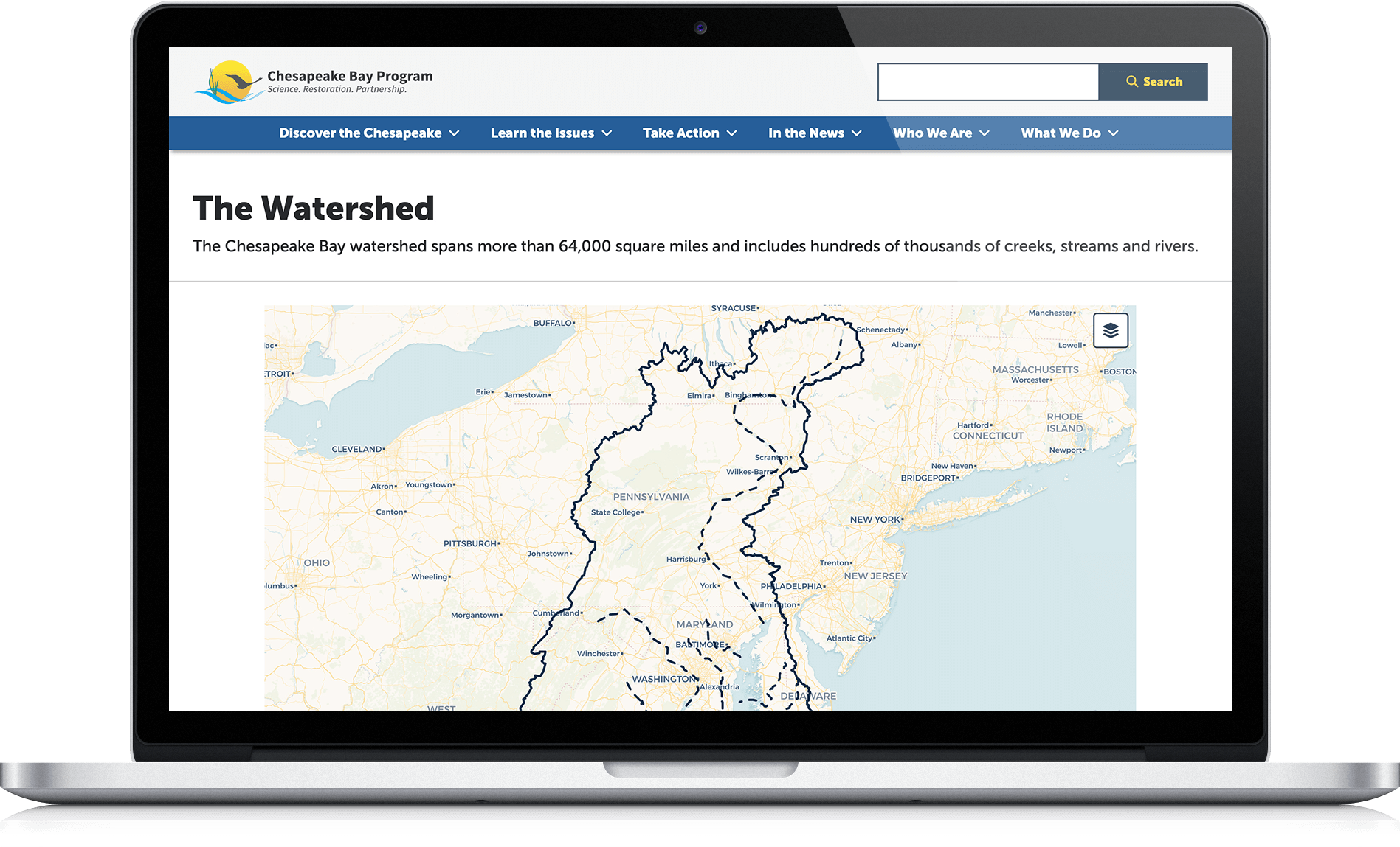
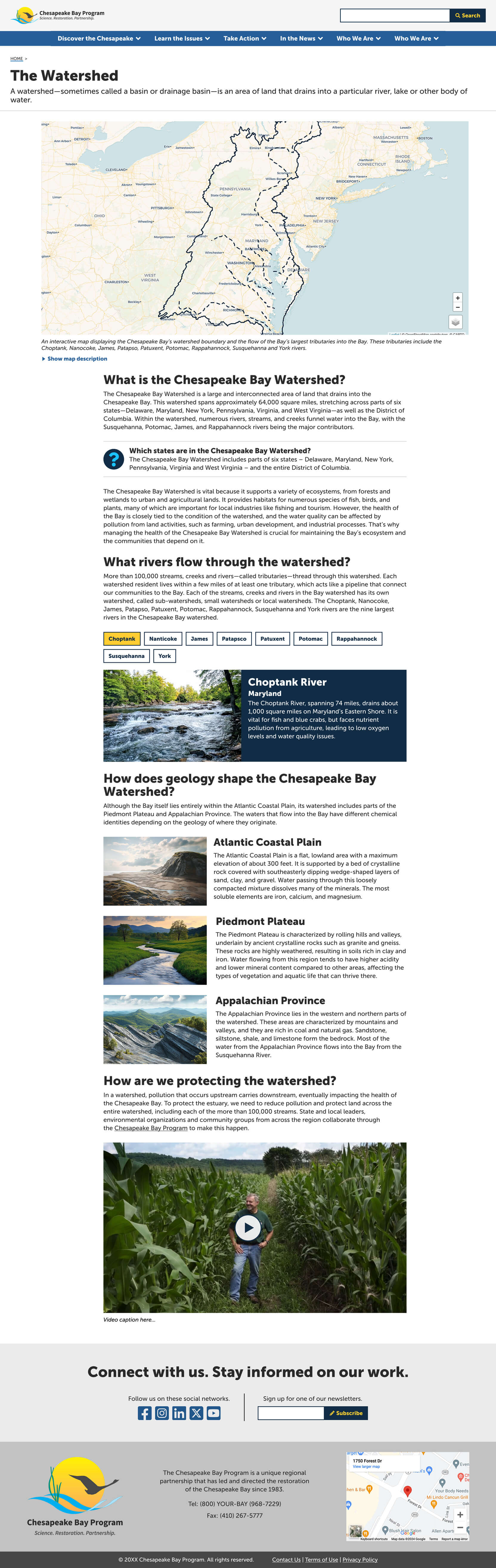
- Unmet User Expectations: Visitors anticipated an interactive map showing how rivers connect to the Bay but found only a static infographic and dense, undifferentiated text. This was clearly expressed by one user during usability testing:
"If there was a waterways map where you could click on the Bay and then you could see all of those 150 major rivers and streams. Cause right now, all you're just seeing is kind of like a satellite view of the Bay. But, it doesn't let you really see how many water contribute to the Bay."
- Inefficient Layout: The two-column layout included an empty sidebar, creating unnecessary visual clutter and confusing users.
- Lack of Interactivity and Visual Engagement: The static content lacked interactive elements, content variety, and visual clarity, making it harder for users to engage and retain information.
- Fragmented and Poor Content: The static content lacked interactive elements, content variety, and visual clarity, making it harder for users to engage and retain information. Also, key geological context was separated on a different page, forcing users to leave the watershed page for related information.
Scroll to explore the full layout.
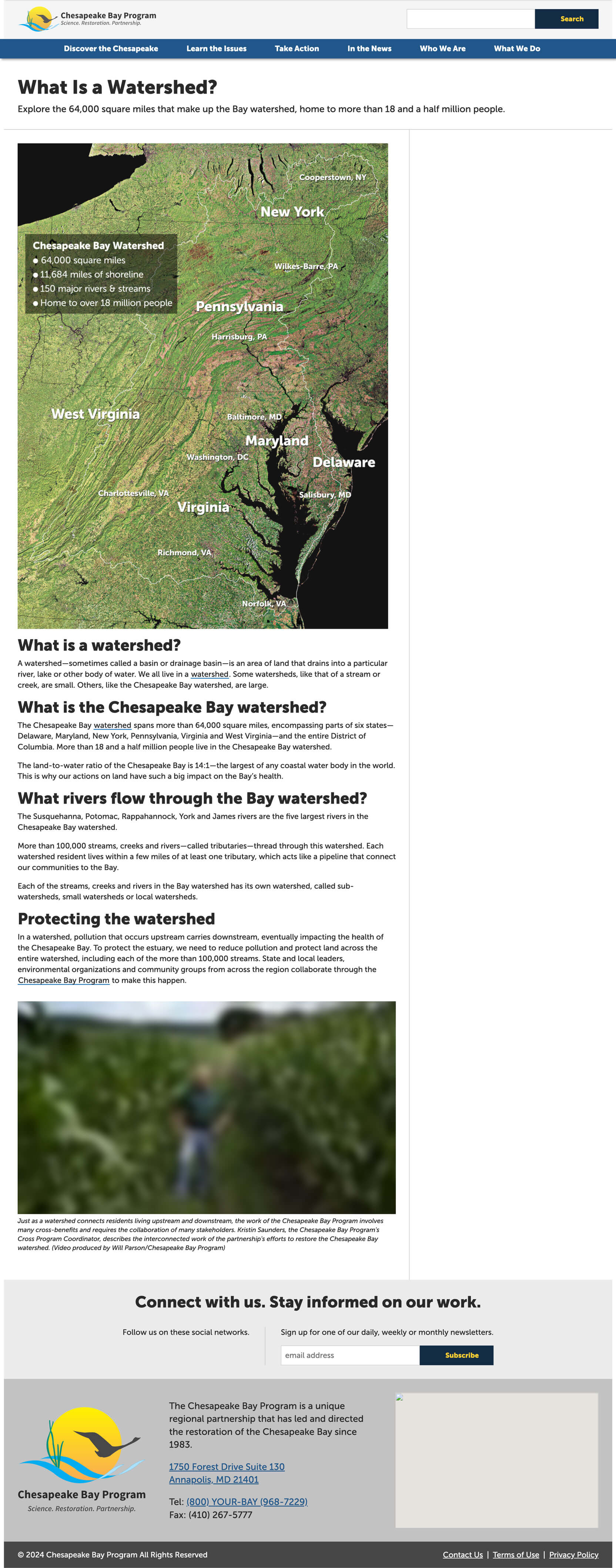
The Solution:
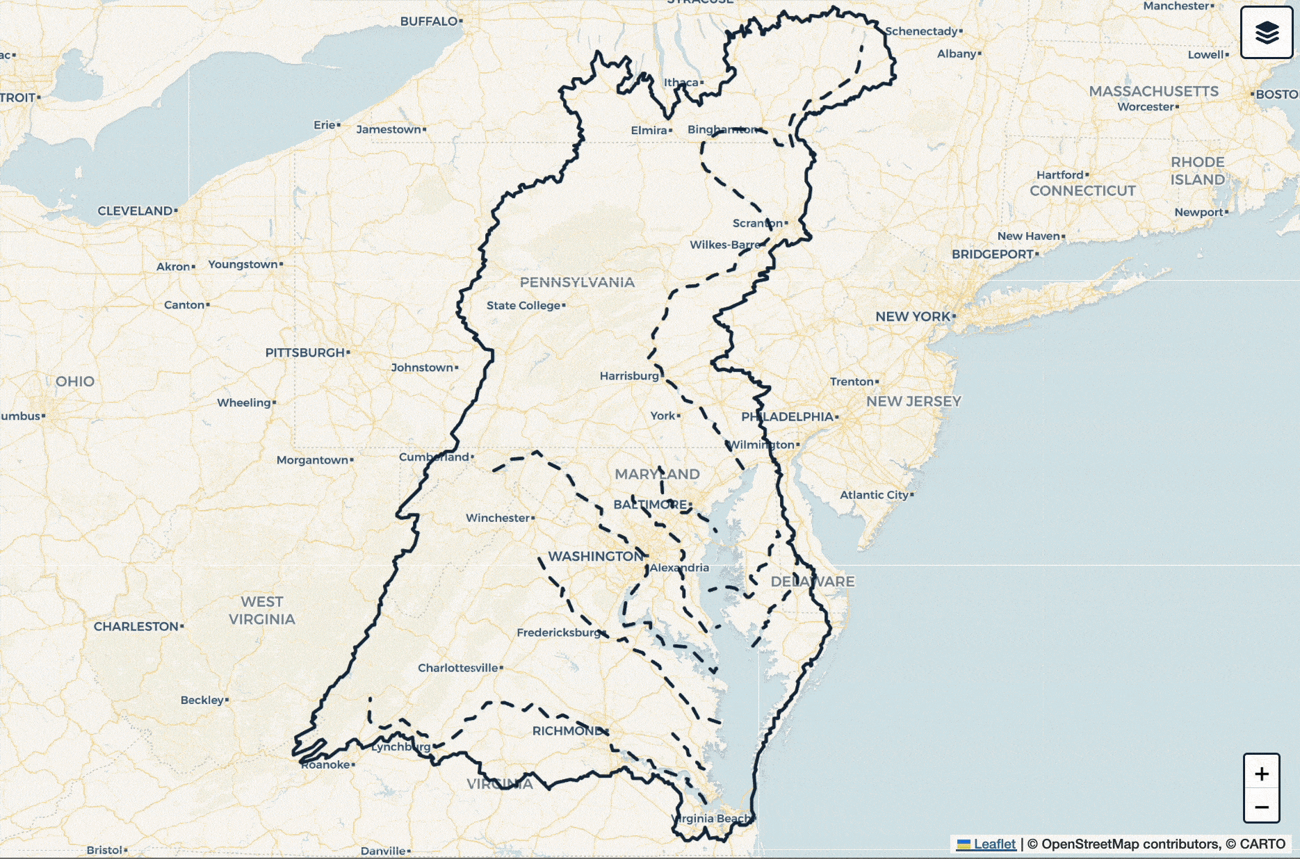
To address the usability and engagement issues, I redesigned the static, content-thin page into an interactive, visually driven learning experience. At the core of my redesign is a custom-built interactive map featuring the nine largest tributaries flowing into the Chesapeake Bay. I developed the map with three selectable layers—light, dark, and topographic—along with the ability to toggle river visibility on and off. I also implemented tooltips that appear when hovering over rivers or watershed boundaries, providing instant identification without interrupting exploration.
I replaced the two-column layout with a clean, centered single-column design to improve readability, and introduced modular content blocks to reduce long scrolling and make navigation easier. I integrated key geological content, previously siloed on another page, directly into the watershed narrative to provide richer context and a more cohesive learning experience. These updates emphasize clarity, interactivity, and responsiveness, directly meeting user expectations and significantly enhancing the page’s educational value.
My Role:
- GIS Developer: Led the design and development of the interactive tributary map using GeoJSON, Leaflet.js, and HTML/CSS/JavaScript.
- Content Strategist: Directed the overall structure, layout, and content strategy to ensure a cohesive and user-friendly experience.
- Product Design: Created high-fidelity prototypes to visualize layout, interactive components, and content flow before development.
- UX Research: Participated in early usability testing led by our UX researcher, documenting insights that informed the redesign. After taking on the remainder of the project, I developed the test questions and ran an unmoderated usability study with public-facing users to validate the updated design.
Who I Worked With:
This project was a collaboration with members of the Chesapeake Bay Program Web Team, whose expertise across research, content, and development helped shape the final product.
User Research & Data Collection:
The project began with a usability test of the homepage and key subpages it linked to, which included the watershed page. I supported this process by taking notes during testing sessions and helped translate user insights into actionable changes.
The feedback highlighted a consistent theme that users wanted to visually explore what makes up the Chesapeake Bay Watershed. In parallel, I conducted technical research to learn how to build the interactive map, using ChatGPT to quickly learn geospatial tools, data formats, and rendering techniques. I also audited and reorganized content originally found on a separate “Geology” page to ensure it was better placed within the new watershed context.
Map Development:
- Tool research: Researched geospatial tools and mapping methods using ChatGPT to build foundational knowledge.
- Mapping framework: Selected Leaflet.js for its simplicity, flexibility, and performance on interactive map projects.
- Data structure: Used GeoJSON to organize and render data for the 9 largest tributaries.
- Interactivity: Developed clickable map layers that allow users to select a river and view relevant information.
- Component approach: Built the map as a lightweight, reusable component for clean integration into the page.
Prototyping:
A high-fidelity prototype was created in Figma to visualize the new layout, interactive components, and overall content flow before development began. This allowed for rapid iteration and internal feedback on layout, copy, and user interaction prior to coding.
Usability Testing:
After launch, I developed the test questions and conducted an unmoderated test with 8 participants from our public-facing audience across desktop and mobile. The key findings were:
- First Impressions (Desktop): Users responded positively to the map, the river-specific cards, and the embedded video. The map caption helped one user understand the map's purpose.
"Very informative, well written and nice clickables."
- First Impressions (Mobile): Users found the page attractive, engaging, and easy to navigate. The movement of the map drew users in, while the page blurb and map caption oriented small-screen users to the page's purpose. One user appreciated the question-and-answer format of the content.
"Attractive and engaging."
"The user interface is...very simple. The main purpose is to educate people, so it's very, very heavy on text, but it also tries to incorporate more visuals and interactive features.... I think it's trying its best to make something that's not very easy to digest a little bit better."
- Map: Users clearly understood the purpose of the animated lines, quickly found the Layers button, and easily selected/deselected layers and toggled rivers on and off. They panned and zoomed with ease, with several reading and responding positively to the overlaid instructions. The pop-up river labels met expectations, with no one requesting anything "more" in the pop-up itself.
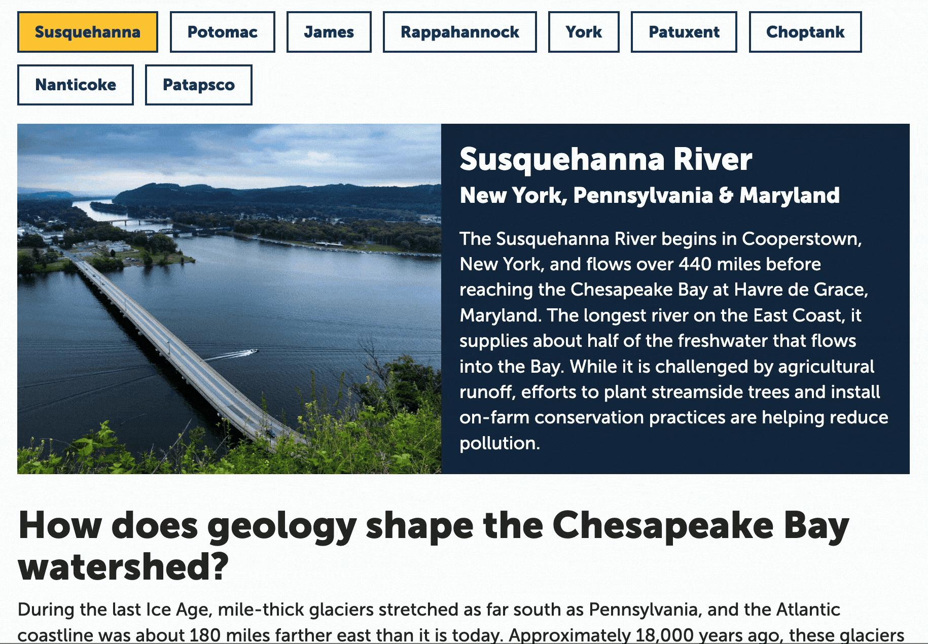
- Page Content: The page content met users' expectations. Most found the detailed information about the specific rivers within our component, and responded positively to both the interactivity and the content itself.
"I like how you can learn about each river. I think it's fun. And the interface of this is well done. Anyone with any level of internet savviness can come in here and do this."
- Final Impressions: The page met or exceeded users' expectations, and taught most users something new about the watershed and the rivers near them.
Final Outcome:
The final design incorporated the following improvements:
- Interactive Experience: A unique map-based interface that allows users to visually explore the nine largest tributaries flowing into the Chesapeake Bay, with selectable light, dark, and topographic map layers, river visibility toggles, and informative tooltips for river and watershed boundaries.
- Custom Component: A self-contained component presenting focused content for each river, including key facts and environmental concerns.
- Improved Layout: Replaced a static, content-thin page with a modular, scroll-efficient design that enhances usability and supports content discoverability.
- Content Clarity: Refined tone, structure, and copy direction to create a more accessible and engaging learning experience.
- Geology Integration: Brought in contextual information from an existing geology page to unify content and eliminate siloed learning.
- Educational Impact: A vastly improved design that invites exploration, supports user expectations, and elevates the educational value of the page.
Scroll to explore the full layout.
Impact & Next Steps:
Since launch, the redesigned page has measurably increased engagement. Average engagement time rose from 1m 35s to 2m 10s, a 35-second improvement that suggests users are finding the content more valuable and exploring it more deeply.
Ongoing efforts include:
- Reviewing Analytics: Monitoring analytics such as time on page and interaction rates.
- Continued Improvement: Future iterations may expand interactivity with additional tributaries, data overlays, or new animations.
Key Takeaways:
- User Expectations Should Drive Experience Design: Users wanted interactivity, not static facts.
- Clarity and Simplicity Matters: Focusing on the 9 largest rivers struck a balance between simplicity and substance.
- Collaboration is Key to Success: This project highlighted the importance of cross-team collaboration. Working closely with internal teams ensured that the final product aligned with user needs and expectations.
- Learning New Tools Pays Off: Building the interactive map deepened my experience with geospatial data and front-end tools.
- AI Tools Can Accelerate Learning: ChatGPT played a valuable role in helping me quickly get up to speed on geospatial and development concepts.
- Small Layout Choices Matter: Removing the empty sidebar and centering content significantly improved user focus and experience.