Project Overview:
I led the creation of the Protect Local Waterways website — a brand-new, purpose-built resource to help local elected officials and community leaders access practical, actionable guidance for protecting waterways. The site’s centerpiece, the Local Government Guide to the Chesapeake Bay, was transformed from a static contractor-developed set of PDF educational modules into an interactive, easy-to-navigate experience. Through research-driven design, streamlined information architecture, and accessibility-focused development, we delivered a platform that makes critical environmental resources faster to find, easier to understand, and more engaging for a diverse audience of stakeholders.
The Goal:
Create a centralized, user-friendly platform that empowers local government officials and municipal staff with quick access to reliable, actionable resources for protecting waterways. The site needed to present complex environmental information in a clear, engaging way, reduce barriers to finding relevant content, and ultimately support more informed decision-making at the local level.
Pain Points:
- Static Format: The educational guide was split into multiple modules, each delivered as a static, slide-based PDF.
- Limited Accessibility: The format was not mobile-friendly or optimized for assistive technologies, making it harder for some users to access.
- Low Engagement: Minimal interactivity, dated visuals, and a lack of modern design elements reduced user interest.
- Inefficient Navigation: Users had to scroll through long, linear documents with no quick way to jump between topics or find specific content.
- Buried Resources: Important action steps and supporting materials were hidden within dense text, and downloading them required extra effort.
- Lack of Practical Application: The static layout made it harder for users to integrate the material into their daily work.
Scroll to explore the full module.
The Solution:
I transformed the static, multi-PDF guide into a fully interactive, web-based learning experience. The new format featured a clean, modern interface with clear navigation, enabling users to move seamlessly between modules or jump directly to specific topics. Content was reorganized into bite-sized sections, paired with engaging visuals, interactive elements, and accessible design to improve comprehension and retention. Supportive resources—previously buried in the PDFs—were surfaced throughout the experience and made available as easy, one-click downloads. The platform was built with responsive design and accessibility best practices, ensuring a smooth experience across devices and compatibility with assistive technologies. The result was a dynamic educational tool that not only delivered information but empowered users to apply it effectively in their daily work.
My Role:
- Branding: Designing the logo and creating a comprehensive brand and style guide to establish a unified visual identity for the website.
- Product Design: Creating wireframes, low-fidelity mockups, and high-fidelity prototypes for the website's key pages and features.
- Collaborative Design Process: Worked closely with the UX researcher, who conducted user research, including personas, surveys, and user interviews. I used these insights to guide my design decisions and ensure the website was user-centered. Additionally, I assisted with comparative analysis to understand industry standards and best practices.
- User Testing & Quality Assurance: Led unmoderated user testing and performed quality assurance to ensure the final product was functional and met the needs of the users.
Who I Worked With:
This project was a collaboration between myself and the Chesapeake Bay Program Web Team, which included developers, content strategist and other stakeholders from environmental and educational sectors. The project was highly collaborative, with input and feedback from key figures in the local government and environmental protection fields.
User Research & Data Collection:
As mentioned previously, I worked closely with the UX researcher to review research findings which included personas, survey results and user interviews. This helped me understand the users’ goals, behaviors, and challenges, which directly influenced my design approach.
I carefully reviewed all of the existing PDF modules to better understand design patterns, content types and existing design elements such as icons and color palette.
Key Findings:
- A stand alone site is needed: The site should live outside of existing products and have a unique name and URL.
- Find balance between quick access to information and information overload: Initial user interviews revealed that users want quick access to modules with minimal steps and clear descriptions to assess relevance. They requested slide previews, multiple download formats, and access to supplemental resources. Clear and consistent module labeling was also identified as important for long-term usability.
- Continued marketing will be a key to success: Users emphasized the need for a long-term marketing strategy and greater transparency around module updates. They suggested using updates as promotional opportunities and recommended adding an “Updates” section in the future to keep users informed.
- Content may be valuable for audiences beyond elected officials: Users recommended keeping the modules as-is but suggested adjusting website keywords and marketing to appeal beyond local elected officials, including future candidates and higher education students.
These findings are reflected in user interview responses:
Quick Access to Information: “To be honest, I’ve been on it before (PDF guide) but I really haven't done any deep dives. The availability of my time to really dig into some of these things isn't there.” “A tutorial or a quick overview would help…”
Audiences: "These days there is a steady turnover of new officials. Trying to get this information to them even before they are elected would be helpful.”
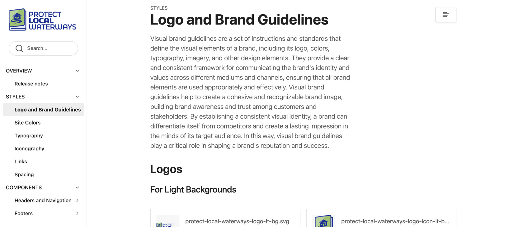
Logo & Style Guide:
- Logo Concept: Slightly opened guidebook with a home and waterway, symbolizing the connection between community, education, and environmental stewardship.
- Layout & Typography: Icon on the left, “Protect Local Waterways” in blue text on the right. Typeface is FinalSix — a versatile sans-serif inspired by the movement of water, with rounded tops, bottoms, and diagonals that create a wavy feel. Selected to visually reinforce the project’s focus on waterways and environmental themes. Bold weight is used for “Protect” and “Waterways,” and a heavier weight was used to emphasize “Local.”
- Color Palette: Medium blue, medium green, and soft white, based on the original PDF guide’s colors, to maintain continuity and familiarity for existing users.
- Style Guide: Covers logo and brand guidelines, site colors, typography, iconography, link styles, spacing rules, UI components (headers, navigation, buttons, cards, footers, downloads bar, tag designs), and resources such as design tokens and high-fidelity prototypes for consistent application across all materials.
Click to explore the full guide.
Prototyping:
Using Adobe XD, I created wireframes, low-fidelity mockups, and high-fidelity prototypes in mobile, tablet and desktop views to define the website’s layout, functionality, and user flow, ensuring intuitive navigation through modules and resources. The designs were refined iteratively to enhance the interface and interaction patterns, meeting established usability and accessibility standards.
User Testing & Quality Assurance:
- Led an unmoderated user test to evaluate the prototype's functionality and usability. The test was overwhelmingly positive with users commenting:
“If I had a magic wand, improving this website is probably not what I would be focused on. Because I think this is high-quality, and I'm really hesitant to make any suggestions for change.”
“I think it was very easy...to determine the purpose of this site. It states it in very clear terms, [and] gives a variety of ways to use the site. Local governments—I don't think they would have any problems, and I think they'll like having everything all in one place.”
“I like the appearance of the website, and…the array of topics that are available there…There are many opportunities to learn more, if you want to expand your horizons besides or beyond what is provided.”
- Performed extensive quality assurance testing to ensure that all features were working as intended.
Final Outcome:
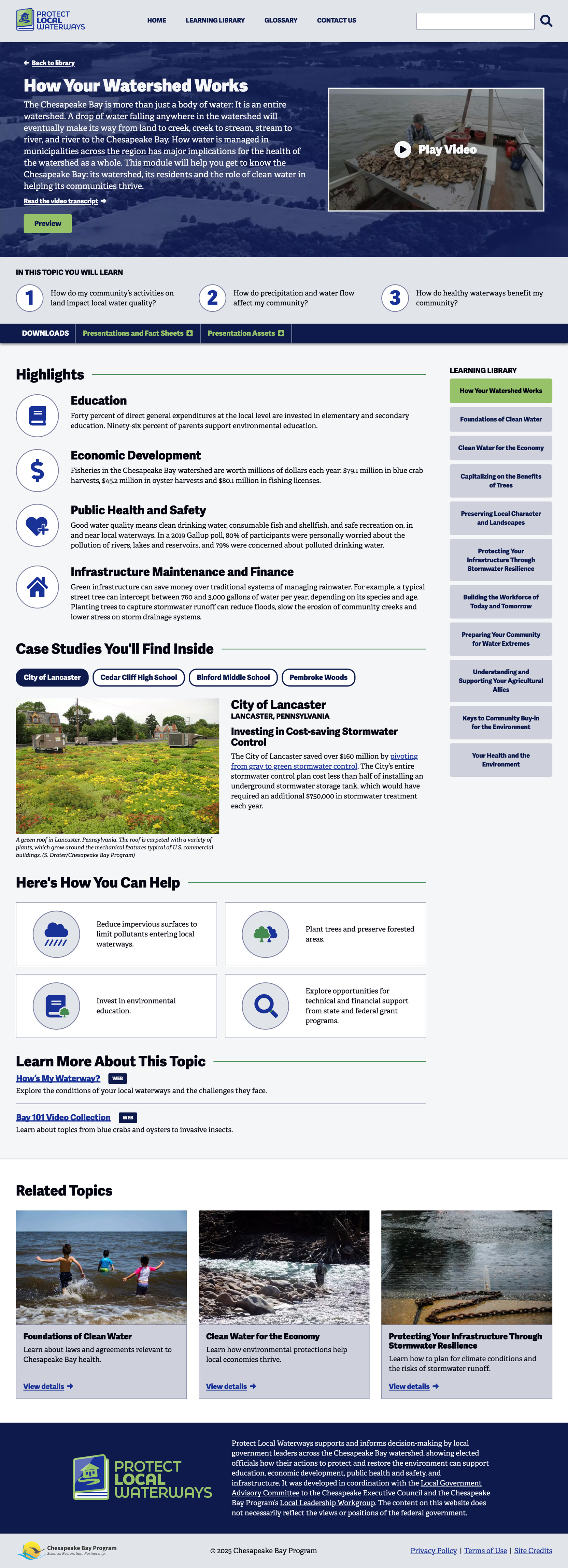
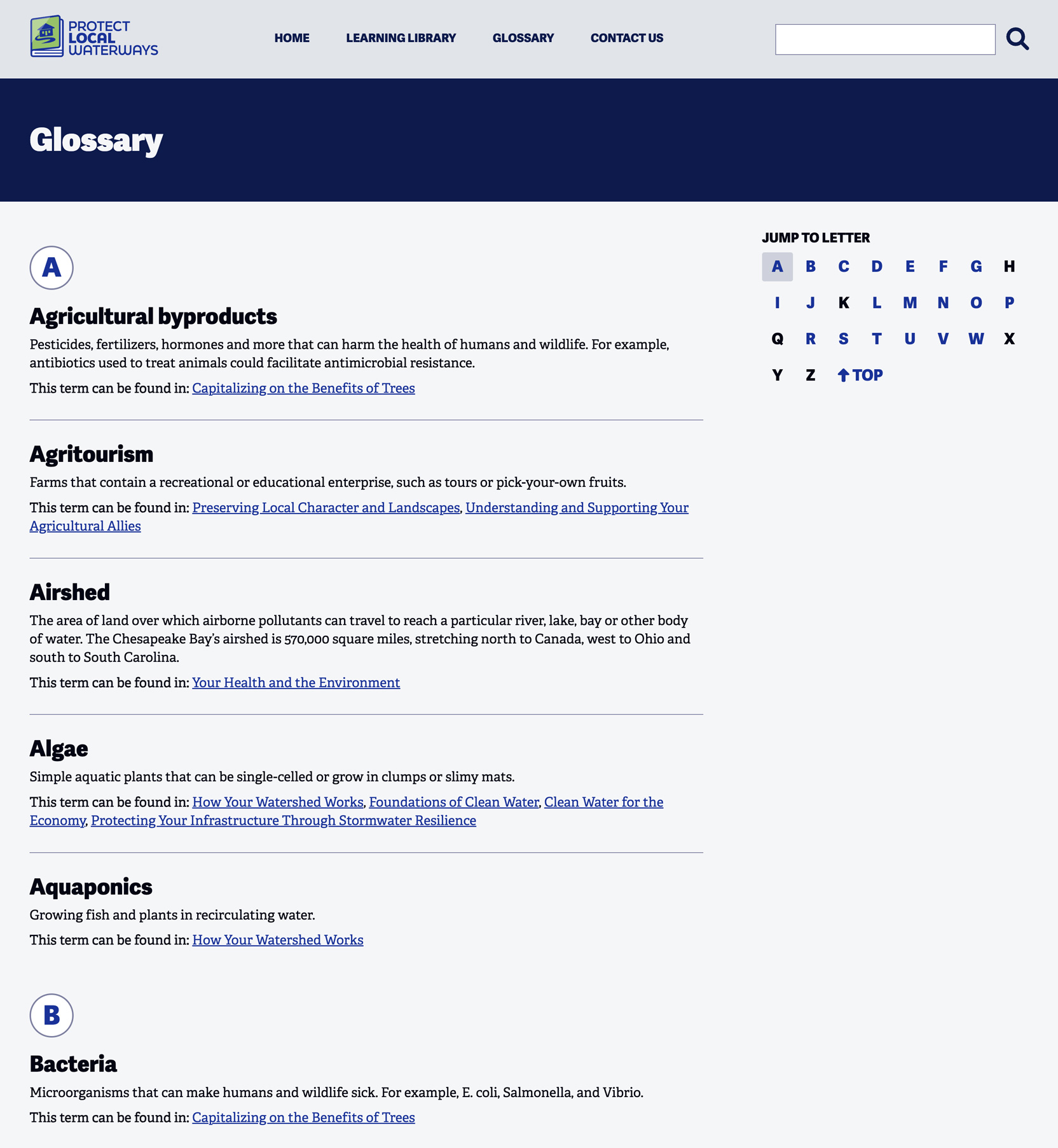
The Protect Local Waterways website successfully transitioned the educational materials from static PDFs to a dynamic, interactive web platform. The site features:
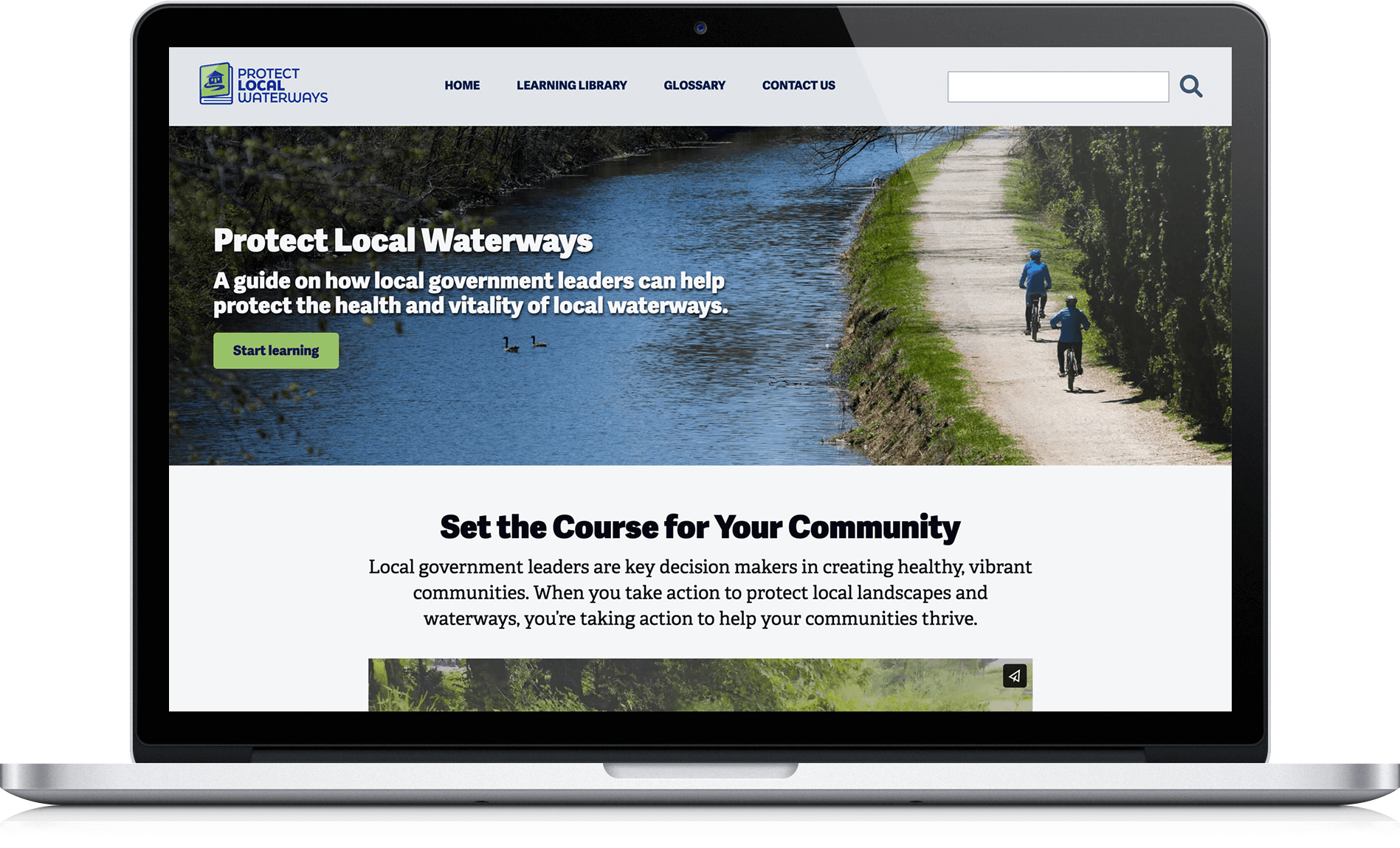
- Impactful Homepage: A clear and inviting homepage with a clear call-to-action, interactive video content, key educational priority highlights and user reviews.
- Easy to Scan Learning Library: A clean, organized grid layout with modules that are easily scannable, each offering detailed information and downloadable resources.
- Content Rich Module Pages: In-depth pages for each module, featuring videos, case studies, and key takeaways to enhance learning.
- Interactive Glossary: An interactive glossary for users to easily access definitions of key terms.
Scroll to explore the full layout.
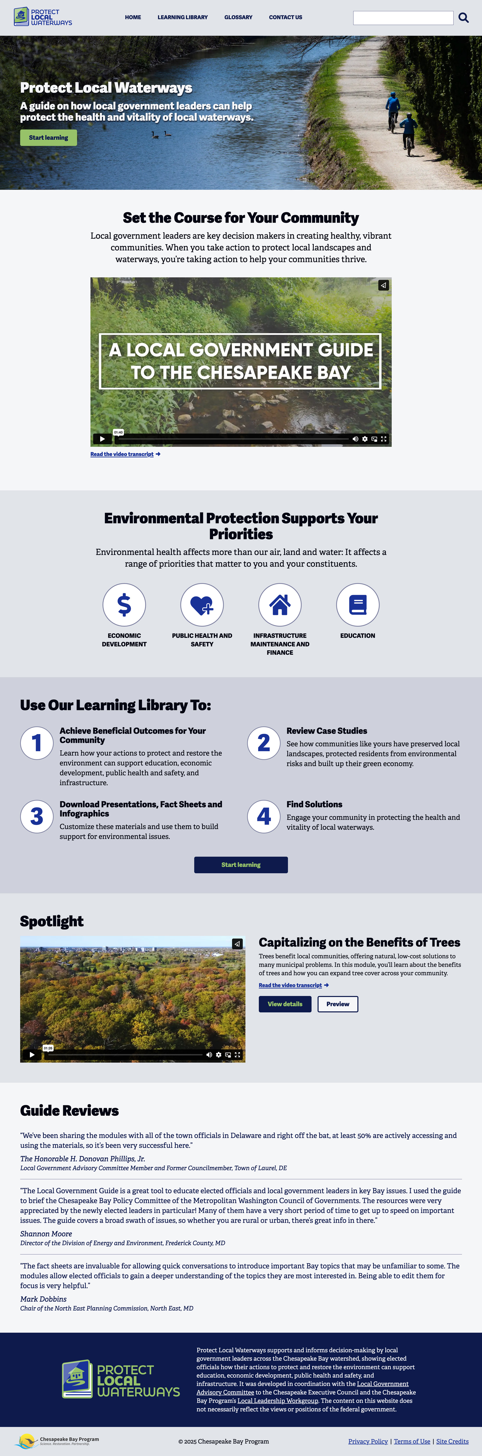
Scroll to explore the full layout.
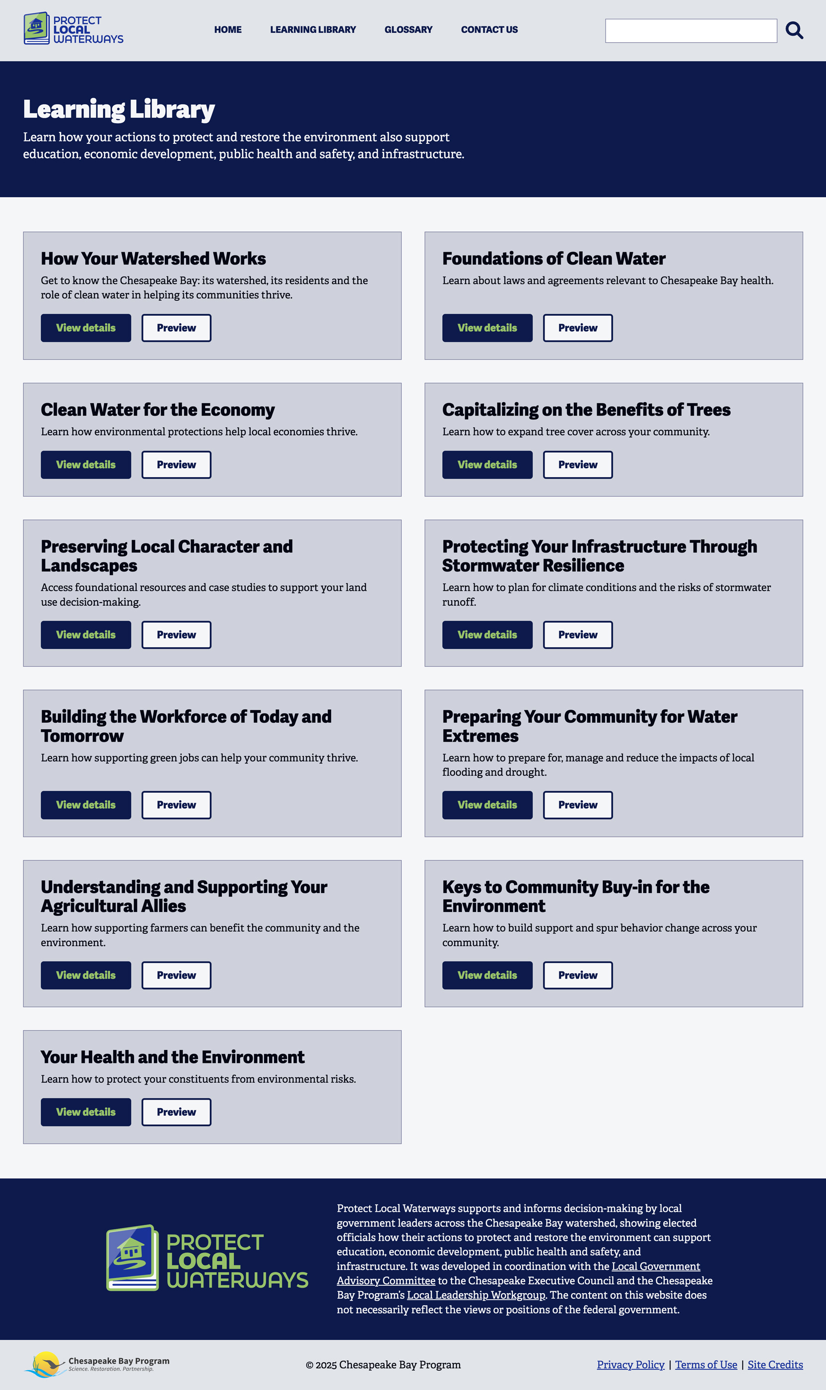
Scroll to explore the full layout.
Impact & Next Steps:
- User Impact: Local government staff and other stakeholders have embraced the platform, as it has made their roles in waterway protection more efficient. The website’s interactive nature and ease of use have significantly improved engagement with the educational materials. Feedback from users indicated a significant improvement in ease of use and satisfaction with the new digital format.
- Team Impact: The success of the project has been recognized by industry professionals, earning a Gold Webby Award for Sustainability, Environment & Climate in 2024. This accolade honored the project as best in class among federal, state, or local government initiatives or campaigns that engaged communities and inspired action on sustainability, environmental, and climate issues, further validating the website’s effectiveness and user-centered design approach.
- Future Improvements:The website could benefit from continuous content updates and the addition of more interactive features, such as community-driven feedback or collaborative tools for local government officials.
Key Takeaways:
- User-Centered Design: Throughout the project, I ensured that the design decisions were rooted in the real-world needs of the target users (local government staff and stakeholders).
- Collaborative Process: Working alongside the UX researcher to ensure that design decisions were informed by research findings was essential to delivering a solution that truly met the needs of the users.
- Iterative Testing: Conducting unmoderated user testing early and often was critical to refining the website's functionality and usability.
- Cross-Functional Collaboration: Working closely with content strategists, developers, and other stakeholders was key to delivering a solution that met both user and organizational goals.